
Length:
3 weeks
Role:
UX Designer, UI Designer

Navigation
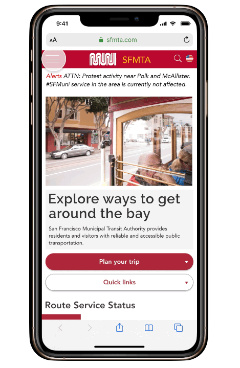
SFMTA's navigation was completely re-designed to allow users to easily search and discover new content. An added visual icon makes navigation more user friendly and accessible to non-English speakers. The newly enhanced SFMTA's sticky top navigation provides easy access to all navigation categories and plan trip features no matter how far down the page you may have scrolled.


Homepage
The new responsive homepage now follows a clean modular grid system. This grid system with typography provides users with visual hierarchy and flow throughout the entire page.
The edge-to-edge horizontal carousel design was also introduced to highlight main tasks according to 2016 SFMTA website redesign report. By doing so, the content and Call To Action (CTA) have been integrated into a new visual design making it easier for users to search the content and more efficiently achieve their goals.


Call to Action
SFMTA now takes full advantage of your browser's viewing space by expanding the plan trip feature/call to action (CTA) on the landing page. In addition, users are now able to make a trip by simply clicking through the Plan trip button.
The most significant change is a new plan trip feature/ call to action (CTA) design which eliminates the prior need to rely on a third party, Google Maps only, for navigation. It's no longer necessary for users to go to Google Maps they able to efficiently access all of the information they need on the SFMTA site.


Problem Statement
CASE STUDY
Today, San Francisco residents and visitors who want to look for SF Munin route information on the SFMTA.com website quickly get overwhelmed by the amount of information presented and the tediousness of clicking through redundant and cluttered navigation to find the requisite info.
How might we help SF residents and visitors find route information more quickly and with less mental work so that they are empowered and energized to access the city?
Solution
Our design helps SFMTA provide public transit by offering reliable and friendly route information that makes SF citizens and visitors of all socioeconomic backgrounds and ages feel empowered to access opportunities across San Francisco.

Process
There are 4 main steps we have been working on this project to uncover the real problem and the best strategy to solve the user's problems.
-
Persona

Core Task Flow
Trip routing became the main focus of redesign, according to 2016 SFMTA website redesign report, most users use the site for routes and stops (5% usage), and trip planning (4% usage) which are the most commonly accessed pages on the sites.

User Flow Diagram
Based on the current website Sfmta.com, we found a user flow to navigate direction by using google maps as a third party for navigation.
Solution: By creating a new navigation page and redesign the current Call to Action/CTA

Heuristic Analysis
We stand doing heuristic analysis starting from the landing page to refine an insight issue of the SFMTA site. Our preliminary assessment showed these 3 main usability issues:
-
No clear visual hierarchy.
-
Cluttered, lots of content, makes the website uninviting to the user.
-
Navigation is spread across the page and inconsistent from page to page.

Feature Prioritization Matrix
To better understand user insight, problem statements. We have tested with 5 users by going through the SFMTA site, started a review on the landing page, and went through navigations.
Source: User Testing Analysis

Sitemap
We simplified site navigation for easy access to routing information with a card sorting method, as a result like an image below you will be able to see how our new navigation looks like.

User Interface Design
To make the user's interaction as simple and efficient as possible, by doing so, we created a Moodboard and UI style guide to define the branding and styling of the product.


Digital Sketch
3 different individual navigation & homepage sketches help our team consolidate which features we could take it from each one before moving forward creating the low fidelity wireframe.

Sketch A
Sketch B

Sketch C

User Interface Testing
We moved forward by gathering features into one basic design wireframe before the 5 seconds testing. To better understand more about user interface design problems, we redesigned it again and again by taking the feedback from our users to evaluate our final product.
Lo–Fi Wireframe & Prototype
Every design starts from scratch, our team consolidated from 3 different sketches into the 1st wireframe and make it clickable ready for testing. CLICK HERE FOR TESTING

Landing page
Plantrip page

Trip result page

Mid–Fi Wireframe & Prototype
In this process we iterated our lo-fi wireframe and created A/B testing (different color tone, layout, design) to uncover more about the user interface's problem by following this wire-flow as below, so now users are able to complete their trip planning on SFMTA site that being taken to Google Maps (new routing can be still be powered by Google Maps, by embedded.)
Test A vs Test B *click to test


Final Responsive Design
The final design, our team added visual icons make the menu more accessible to non-English speakers, and communicate friendliness. Also, we redesigned the alert banner to make it more stand out, clean and readable for users.
Click here for testing: Desktop version & Mobile version

Desktop Prototype click here
Mobile Prototype click here
Final Thoughts
My team and I had a lot of fun combining our respective strengths to make the site more accessible to a broader audience.
Through testing, we were able to disprove several hypotheses. For one, users responded far more positively to the red color palette than we had predicted.
Due to the limitations of user testing during COVID–19, as well as the fast pace of this project, we were only able to scratch the surface in terms of where we could add value to the SFMTA website.
As the next steps, we would explore the ability to quickly add fare, which was a popular feature request during our user testing. According to SFMTA's 2016 website analysis, adding fare us also the next command use case for the site, after trip routes and stops.
The San Francisco Municipal Transportation Agency's (SFMTA) iconic brand redefines its digital experience for both San Francisco residents and visitors.
Our design helps SFMTA by offering reliable route information in a user friendly format that empowers San Francisco residents and visitors to access opportunities citywide.